
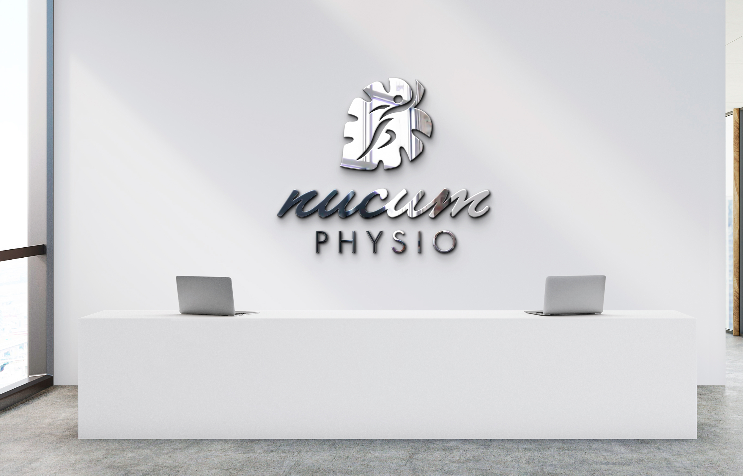
About
Nucum Physio specializes in providing a thorough assessment to understand the causation of prior injuries and create an effective management plan which considers all facets of your life.
Creative Brief
Our goal was to create a logo and identity system that personified a sound mind and a sound body. We needed to communicate that Nucum Physio differs from other competitors because of its holistic approach and understanding of the human body.
Services
Logo | Visual Identity | Branding Guidelines | Business Cards | Letterheads
Logo Breakdown
Logo Construction
Typography
We use both Futura (san serif) and Lakeside (script) to combine both a modern and humanistic quality.
The balance of these two styles represents how Nucum Physio approaches their client treatments.


Color Palette
Dark Green serves as the primary color for the brand, symbolizing nature and the vibrancy of the Monstera leaf.
The secondary colors anchor the primary color. The dark blues pays homage to the foundation of traditional medical practices and science while also resembling night and water.
The colors of the practice complements and contrasts its location in an athletic training facility that is comprised of mostly black and white colors.
#0e5647
RGB: 14,86,71
PMS: 561 C
#359170
RGB: 53,145,112
PMS: 7475 C
#81c29c
RGB: 129,194,156
PMS: 345 C
#283745
RGB: 40,55,69
PMS: 7546 C
#114f69
RGB: 17,69,105
PMS: 5473 C
#FFF
RGB: 255, 255, 255
PMS: White
Logo Set
Primary Logo

Logo Mark

Secondary Logo

Word Mark
Patterns


Mockups


Testimonial

“I was in need of a logo and creative direction with my physiotherapy practice. Neeko was very professional. He listened to my story to better help me understand how we can collaborate with each other to create a brand that best represents me and my values. I am very happy with how it all turned out and it exceeded my expectations.
I love how effortless the process was. It was very exciting to share my passion and energy with someone that has the same drive with his own work.
100% will be back to work with him. Neeko gave me confidence with my brand and helped me legitimize my physiotherapy practice to stand out amongst the rest”